Monday, December 13, 2010

Lovely Windowpane


Here's my first project using the new SU! Beveled Windowpanes!

 layered Marina Mist, Always Artichoke and patterns from the Springtime Vintage dsp. The flamingo image was stamped onto Vanilla, watercolored, then matted with Always Artichoke. I cut slots for the Always Artichoke seam binding with a crafters' blade, then fed the seam binding through the slots in the large beveled windowpane and behind the image. I used a couple of mini-glue dots under where the seam binding covers to secure the cs to the beveled windowpane.

Stamps: Clearly for You

Paper: Marina Mist, Always Artichoke, Vanilla, Springtime Vintage ds

Ink: Black, Baja Breeze, Not Quite Navy, Pear Pizzazz, Always Artichoke, Pretty in Pink, Regal Rose

Accessories: Beveled Windowpane, Basic pearls, Marina Mist 1/8" taffeta ribbon, Always Artichoke seam binding, Dimensionals, Aquapainter, Exacto knife, mini-glue dots, Ticket-Corner punch

Sunday, December 12, 2010

Buttons on a Card


Ever since I saw the Sweet Buttons embosslit, I've been wanting to do buttons on the button card from Sew Suite! This is the first result -- and I'm sure that there will be others.

I layered Tangerine Tango, Poppy Parade and Pear Pizzazz. The buttons card from Sew Suite was stamped in Poppy Parade, then overstamped with Versamark and clear embossed. The Top Note layer was cut from the Sew Suite fabric.

Stamps: Sew Suite

Paper: Tangerine Tango, Poppy Parade, Pear Pizzazz, White

Ink: Poppy Parade

Accessories: Big Shot, Sweet Buttons embosslit, Top Note die, Square Lattice Textured Impressions folder, Subtles brads, Poppy Parade stitched ribbon, Sew Suite fabric, Sizzix adhesive sheets, Dimensionals, pinking shears, needle and white thread

Wednesday, December 8, 2010

SU Creative Crew!


I am so happy to announce that I've been chosen to be part of the Stampin' Up! Creative Crew on Splitcoast Stampers!

The SU Creative Crew is basically going to showcase Stampin' Up! products. Starting on January 1, all demos will be invited to participate in the challenges and upload their work into a public gallery on Splitcoast.  It's going to be very like the Fan Club, but you do not have to pay to see it!

Here is a list of my fellow team members.  You can click on their names to see their fabulous blogs!


I would like to thank Jana (indyemmert), Susie Nelson, Patty (pattyb) and Lydia (Understandblue) for allowing me this opportunity.

Saturday, December 4, 2010

Botanical Gazette


This came out a bit darker/differently than I wanted. I went to spritz the finished central layer with Log Cabin Smooch Spritz and it came out too heavy on the left side. It was too much work, so I'll have to live with the result!  I tried to balance out the heavy spritz with a little more color, but I think that it came out looking a little to contrived.  Better luck next time!

That central layer was a sheet of notebook paper from the Botanical Gazette ds. I sponged Close to Cocoa and Chocolate Chip on the "flat" side of the Framed Tulips Textured Impressions folder and ran the piece of ds through the Big Shot. Afterwards, I lightly watercolored the tulips and frame with a wash of Not Quite Navy.


Stamps: Nature Walk, Winter Post


Paper: Not Quite Navy, Early Espresso, Botanical Gazette ds


Ink: Early Espresso, Crumb Cake, Chocolate Chip, Not Quite Navy


Accessories: Big Shot, Framed Tulips Textured Impressions folder, Early Espresso 5/8" satin ribbon, metallic brads, sponge, Aquapainter, Dimensionals, Log Cabin Smooch Spritz


Friday, December 3, 2010

New Springtime Vintage suite from Stampin' Up!


I layered Rose Red, Not Quite Navy, Vanilla and a sheet from the Springtime Vintage ds. The Vanilla layer was color embossed with a very light sponging of Baja Breeze ink around the tulip edge, then run through the Big Shot in the new Framed Tulips folder -- which I totally adore!! The Rose Red frame was stamped in Vanilla craft ink and clear embossed.  I cut out two additional frames and offset them behind the Rose Red frame to give it a little more depth.

Stamps: Baby Blossoms

Paper: Rose Red, Not Quite Navy, Vanilla, Springtime Vintage dsp

Ink: Craft: Vanilla. Classic inks: Pear Pizzazz, Not Quite Navy, Always Artichoke, Baja Breeze

Accessories: Big Shot, Framed Tulips Textured Impressions folder, Adornments, Basic Pearls, sponges, Rose Red seam binding, lace trim, Dimensionals, mini glue dots, clear ep

Thursday, December 2, 2010

Sew Suite from the new SU! Occasions Mini!


I love the new pompom trim! Its pretty flat and the pompoms are close together, so it's easy to work with. The row of pins are from the rub-ons and the tape measure is from Sew Suite.  I see lots of possibilities with the pieces of this new suite!


Stamps: Sew Suite, Picnic Parade


Paper: Melon Mambo, Daffodil Delight, Tangerine Tango, White


Ink: Black, Tangerine Tango, Melon Mambo


Accessories: Sweet Stitches rub-ons, Tangerine Tango pompom trim, Sweet Stitches big designer buttons, white thread, brights brads,dimensionals, aquapainter

Splitcoast Stampers WICKED challenge for November! WKD1110A & WKD1110B


Here is my submissions for this months' Wicked challenge. I did the first two parts of the challenge -- a square card and the color challenge (Rich Razzleberry, Pear Pizzazz and Tempting Turquoise). Not a color combination that I would naturally think of, but I think that it came up really nice!  I do like the look and symmetry of square cards -- I think that I need to do more of these.  Go here to look at the WICKED Challenge Gallery at Splitcoast Stampers!


Stamps: Merry Crittermas


Paper: Rich Razzleberry, Pear Pizzazz, Tempting Turquoise, Vanilla


Ink: Black, Pear Pizzazz, Garden Green, Regal Rose, Rich Razzleberry, Daffodil Delight


Accessories: Big Shot, Perfect Polka Dots Textured Impressions folder, Bigz Scallop Square Duo die, Glitter Brights brads, Pear Pizzazz 1/2" stitched-poly ribbon, Rich Razzleberry 1/8" taffeta ribbon, Dimensionals, Aquapainter, 3/4" square punch

Wednesday, December 1, 2010

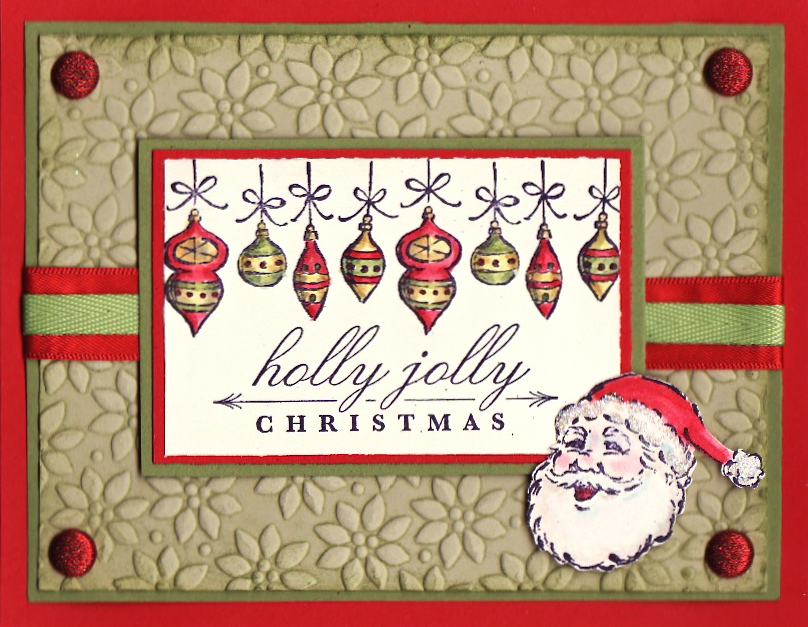
Splitcoast Stampers Color Challenge CC299


I did this card for the newest SCS color challenge, CC299 -- Red Old Rock. I have to say that I would've never, ever put together Real Red, Old Olive and River Rock, but I love it now!  That's the great thing about the color challenges -- they force me to think out of the box.

I love the ornaments on this card -- they remind me of those retro Christopher Radko Shiney Brite ornaments.  I've got old Shiney Brite ornaments from both of my grandmothers.  I love adding the new ones to my collection!

The River Rock layer was color embossed by running it through the Petals-a-Plenty folder, inked with Old Olive.


Stamps: Holiday Heritage, Bright Christmas


Paper: Real Red, Old Olive, River Rock, Vanilla


Ink: Craft ink: White. Classic inks: Black, Blush Blossom, Regal Rose, Riding Hood Red, Cherry Cobbler, Daffodil Delight, More Mustard, Old Olive, Always Artichoke


Accessories: Big Shot, Petals-a-Plenty Textured Impressions folder, Glimmer Brights brads, Real Red 5/8" satin ribbon, Old Olive 1/4" twill ribbon, Dazzling Diamonds glitter, white gel pen, Dimensionals, Aquapainter